Denver Zoo Redesign Case Study
Cover Photo
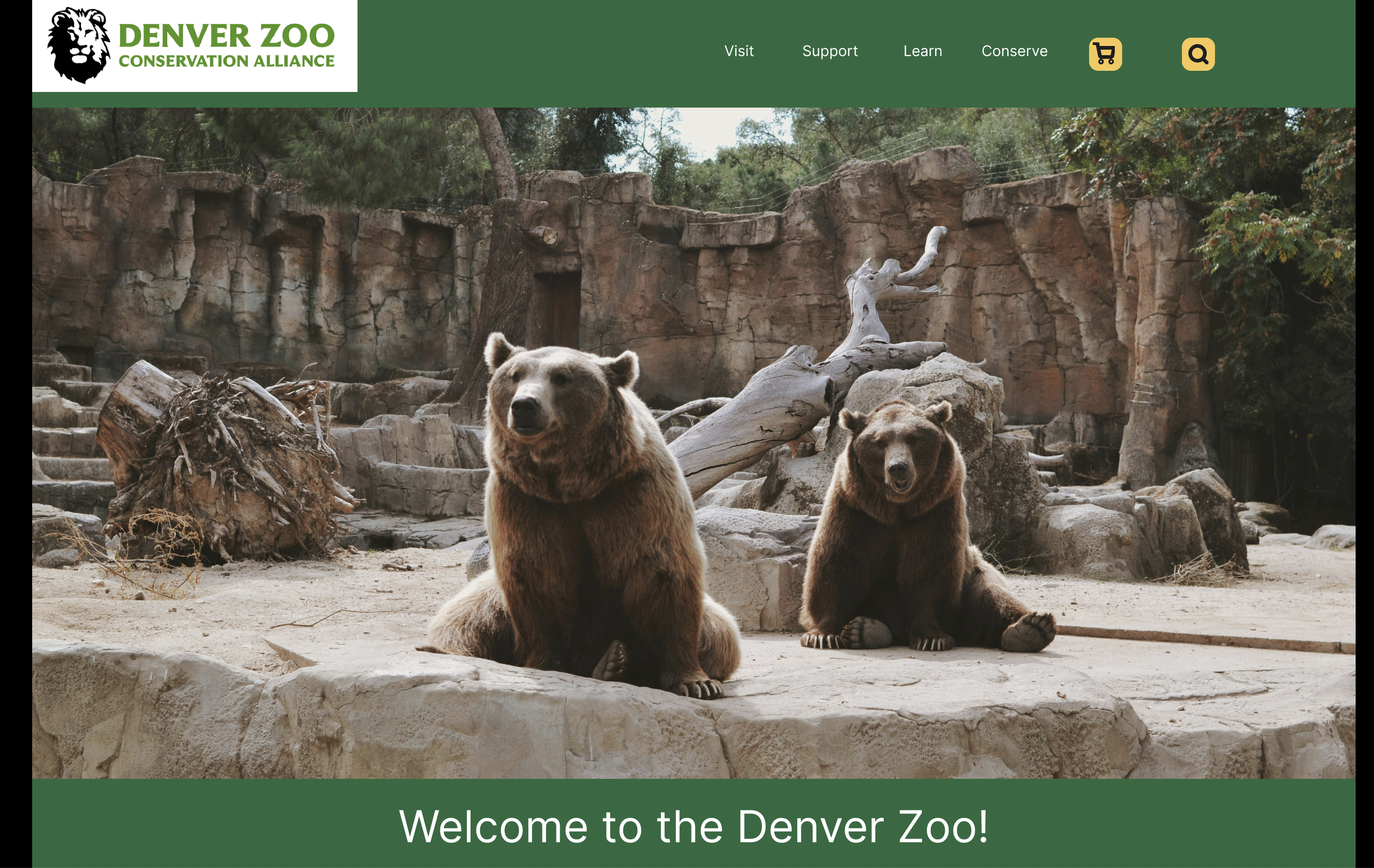
This image is of my high fidelity prototype of the Denver Zoo.

Name of Your Project
Denver Zoo Redesign
Summary
The project was redoing the user flow to buy a ticket. It was important because the user currently has to go through a lot of unnecessary steps and information that may deter them from completing the purchase. The final outcome was a simplified user flow for buying tickets.
My Role
I served as the sole UX designer and researcher for this project.
Challenge
Denver Zoo visitors face a convoluted checkout process filled with repetitive tasks and unnecessary questions. The goal was to streamline the ticket-purchasing experience by eliminating redundant steps and focusing on essential information so that users can quickly complete their orders without feeling deterred. The redesign had to be completed within a tight project timeline, limiting the depth of user research and iterative prototyping.
Research
Usability Testing of Current Experience
I used the existing Denver Zoo website. I tested with 4 different users; most of the pain points were in the log in/guest checkout pages, where users were prompted to enter the same data twice. There were a lot of extra steps in the ticket-buying process. The order of the ages on the ticket page was not intuitive, it was sorted by price not by age. Next, users stated that they had to enter the same information in guest checkout as they would if they made an account.


Competitive Analysis
I looked at Ticketmaster, Booksy, and Amazon to do the competitive analysis, and feature comparison. After that I did user testing on the Denver Zoo website. The “How Might We” statements were:
- How might we improve the ticket page layout to clearly display pricing information and avoid confusion about ticket availability on different days?
- How might we streamline the overall user experience, reducing repetitive tasks and questions during checkout?
- How might we prioritize essential information in the checkout process, so users can complete their purchase quickly?

Design
Problem Statement
Denver zoo visitors need a simplified checkout experience because repetitive tasks and unnecessary questions can make purchasing tickets tedious, discouraging people from completing their orders.
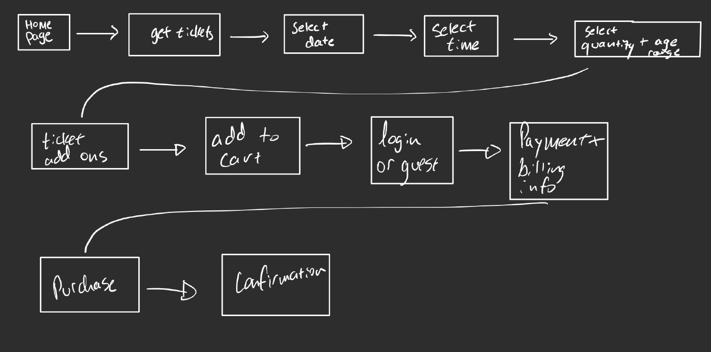
User Flow

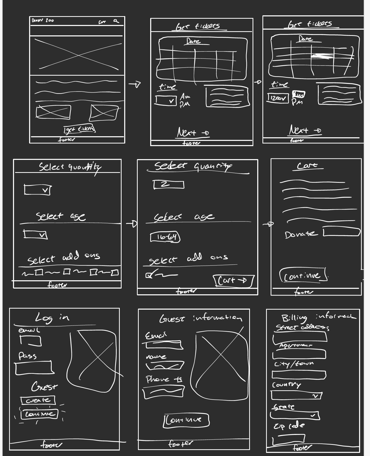
Low Fidelity Wireframes
I created low fidelity wireframes on my iPad: welcome screen, calendar pick, ticket info, login/guest info, billing, confirmation.

Mid Fidelity Wireframes
Based on feedback, I replaced dropdowns with direct quantity inputs and reworked sizing for desktop frames.
 View MidFidelity Prototype
High Fidelity Interactive Prototype V1
I used the Denver Zoo color palette (green, gold, white, black). Links and clickable prototypes were added to simulate the checkout flow.
 View HighFidelity V1 Prototype
High Fidelity Interactive Prototype V2
I changed some design elements, the sizing of the input boxes and text.
 View Final Prototype
Instructor Feedback
Feedback included consistency in sizing/spacing and improving color contrast. One page was not accessible due to contrast issues, so I changed that. This improved accessibility significantly.
Evaluation and Results
User Testing Process and Pain Points
I did moderated sessions; users wanted more info on add-ons (rides, food plan). One button was hard to find, so I updated discoverability. Adding visuals made it less plain.
Updates
I addressed discoverability issues, included more visuals, and refined labeling to clarify the add-ons. This helped users quickly see what they were purchasing.
Reflection
Future Plans
If I had more time, I'd integrate membership incentives into the checkout and potentially develop a mobile app for scanning digital tickets. I'd also track metrics where users drop off to continuously improve the flow.
Conclusion
This project taught me that removing friction and repetitive data entry can dramatically improve user satisfaction. Emphasizing accessibility and clarity made the ticket-buying process quicker and less frustrating.